
Logging In (It's Easier Than You Think)
Your MediaCor website uses your email address as your key. No password to create, remember, or reset — ever.
- Go to your website's address and add /a/login to the end. For example:
yourdomain.com/a/login - You'll see a login page right on your own website, with your site's name and design. There's one box asking for your email address.
- Type the email you used when you signed up with MediaCor, then click Login.
- Check your inbox. Within a minute you'll get an email with a sign-in link. Click it.
- The link opens your Dashboard, and you're in.
yourdomain.com/a/login so it's always one click away. If the email doesn't arrive, check your spam or junk folder.
The login link stays active for 48 hours. Once you're logged in, your browser remembers you — you'll stay logged in until you clear your cache or switch to a different browser.
Welcome to Your Dashboard
This is home base for your website — everything starts here.
Once you log in, you'll land on your Dashboard. Think of it as the control room for your entire site. From here you can jump into the editor, check your stats, manage your blog, and review form submissions.
What you'll see on the Dashboard

Click the image to enlarge
- Site — Your pages, the Edit Site button, and publishing status. This is where you'll spend most of your time.
- Settings — Global site settings: SEO, site name, language, social links.
- Redirects — Send old URLs to new pages automatically.
- Assets — Your media library. Every image, PDF, audio file, and video lives here. Upload once, use anywhere.
- Domain — View and manage how your custom domain is connected.
- Blog — Create new posts, copy existing ones to rework, schedule posts for later, and manage drafts. Comments appear here too.
- Forms — All your forms and their entries. See who filled them out and what they said.
- Members — Add editors with custom permissions, create member-only pages, and manage subscriptions.
- Commerce — Your online store: products, subscriptions, coupons, gift cards, and transactions.
- Visitors & Analytics — Track site traffic, page views, and e-commerce metrics including abandoned cart recovery.
The Edit button
To actually make changes to your website, click the Edit button on the Site tab. This opens the visual editor, where all the real building happens.
The Editor at a Glance
A quick tour before we start building.
The editor might look like a lot at first, but it breaks down into a few simple areas. Once you know where things are, you'll move around it without thinking.
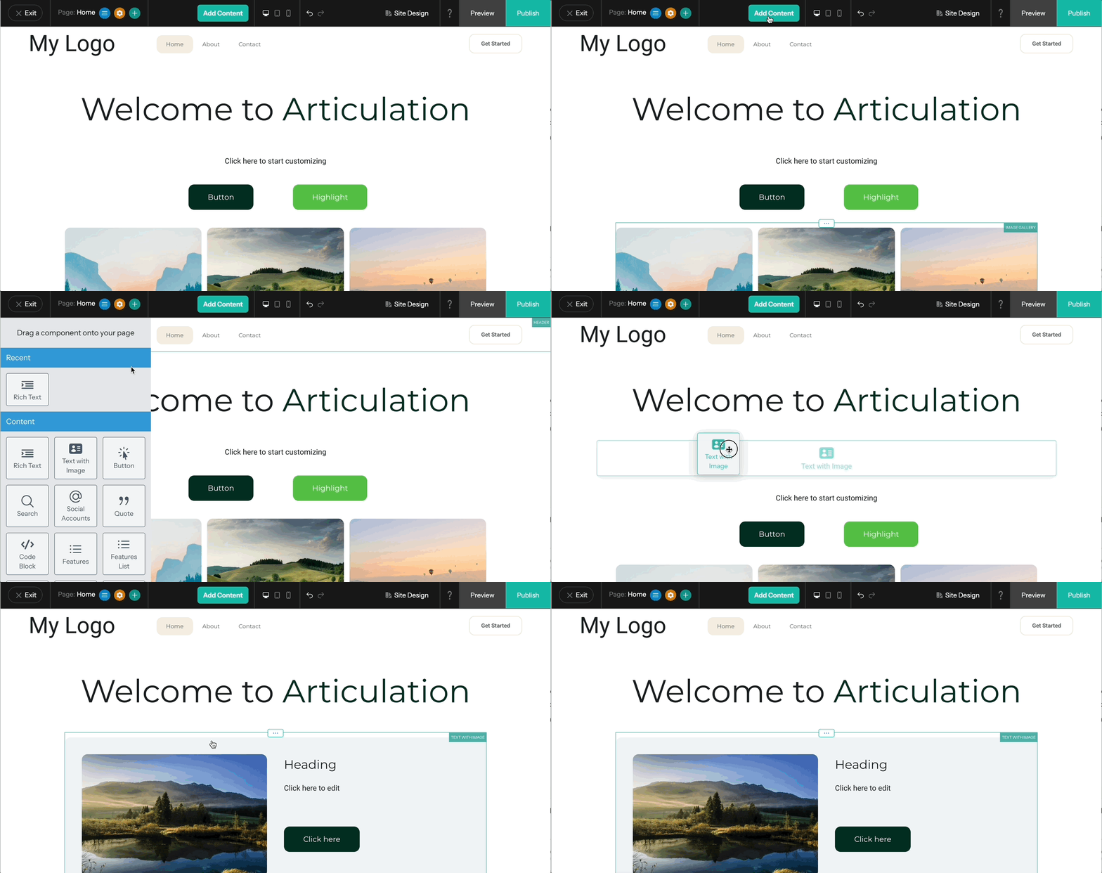
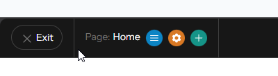
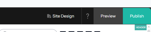
The toolbar, section by section
Hover over each section of the toolbar to see what each button does. Click the image to enlarge.

Building Blocks — Components
Everything on your page is made of Components. Here's how they work.
A Component is any piece of content you add to your page — a block of text, a photo, a button, a form. Building a page is really just a matter of dragging the components you need onto the canvas and filling them in.
How to add a component
- Click the "Add Content" button at the top of the editor. A panel will slide out on the left side.
- Browse or scroll through the available components.
- Click and drag any component onto your page. Drop it where you want it to appear.
- Click on the component to start editing it.
The most useful components to know first
There are dozens of components available, but here are the ones you'll reach for most often. Here's what the Add Content panel looks like when it slides out:

Use the reference grid below to see what each component does and roughly where to find it in the panel above.

Your main writing tool for headings, paragraphs, and lists

Text alongside a photo in one ready-made layout

Clickable buttons that link anywhere

Add photos with filters, hover effects, and captions

Add a search bar so visitors can find content

Highlight a quote or testimonial in a styled block

Show formatted code snippets on your page

Display multiple images in a clean grid layout

Embed a YouTube video by pasting the link

Add custom HTML, widgets, or third-party tools

Add a downloadable file link

Display a PDF directly on your page

Put content side-by-side on your page

A horizontal line to separate sections

Add vertical breathing room between components

Organize components in a repeating grid pattern

Group components together with a shared background

A full-width banner with headline, image, and buttons

Full-width content areas for high-impact sections
Adding and Editing Text
The Rich Text component is where most of your words will live.
The Rich Text component
The Rich Text component is your main tool for adding text to a page — headings, paragraphs, lists, all of it.
- Open "Add Content" and drag the Rich Text component to your page.
- Click anywhere inside the box to start typing. The default placeholder text will disappear.
- A text formatting toolbar will appear at the top of the component.
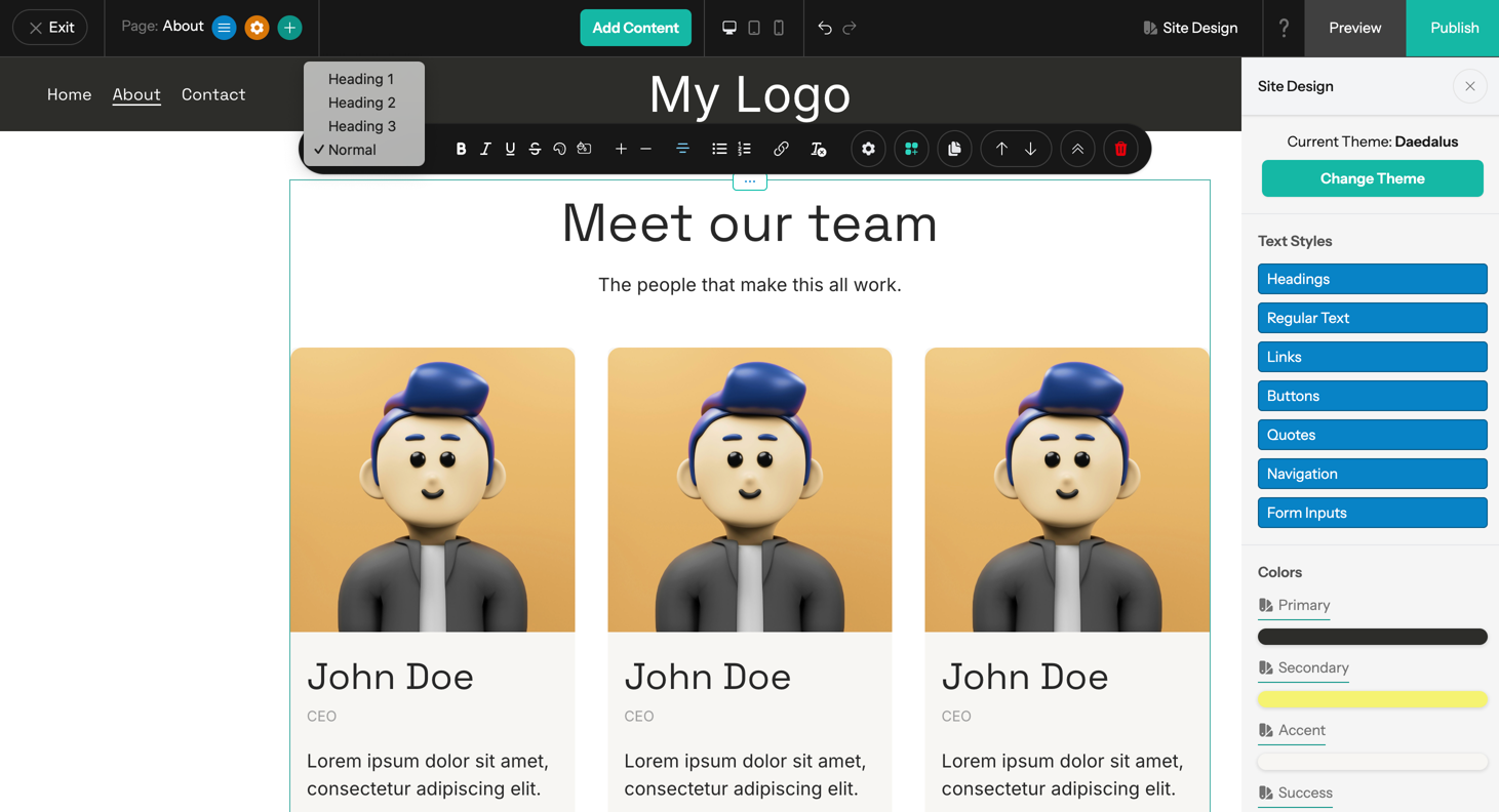
The text formatting toolbar
Here's what each button does:
Text with Image component
This one is great for the classic "photo on the right, text on the left" layout — or vice versa. It combines a heading, a paragraph, and an image all in one tidy component.
Drag it to the page, click to swap in your photo, and type your text. Use the options panel to choose whether the image sits left or right.
Pasted text looking weird?
If you copy text from a Word doc or another website and paste it in, it might bring along hidden formatting that clashes with your site's style. Fix it fast: select the problem text, then click the Tx button in the toolbar. That strips all the extra styling so the text matches everything else on your page.
Adding Images
Upload, resize, style, and add fun effects — all in one place.
- Open "Add Content" and drag the Image component to your page.
- Click the image area. An options panel will open on the left side.
- Click "Upload Image" to add a photo from your computer.
- Once uploaded, use the options panel to adjust everything about the image.
Image options explained
Layout with Columns
Put any two (or more) things next to each other on your page.
By default, everything stacks vertically on a webpage — one block on top of the next. The Columns component lets you place things side by side, like a photo next to a paragraph of text.
- Open "Add Content" and drag the Columns component to your page. It starts with two empty columns.
- Drag other components (text, images, buttons — anything) into each column.
- To resize columns, click and drag the vertical divider between them left or right.
- Or use the Size option in the settings panel to set exact proportions (e.g., 50/50 or 30/70).
Adding more columns
Need three or four columns? Click the "Add" button in the options panel to add another column. Click the red X next to a column to remove it.
Column spacing
The Spacing dropdown controls the gap between columns. It defaults to a small gap, which looks clean. You can increase it if you want more breathing room.
Columns on mobile phones
By default, your columns will automatically stack on small screens (phones). That's a good thing — it keeps your content readable without the user having to zoom in or scroll sideways.
But sometimes you want two columns to stay side by side even on mobile — like a small logo next to a name. For that, turn on the "Prevent Collapse on Mobile" toggle in the settings panel.
Creating Pages
Adding a new page takes just a few clicks.
Adding a new page
- Click the Plus (+) button near the top left of the editor toolbar.
- A popup will appear. Type in your page name and adjust any settings.
- Click "Add Page." The new page will appear in your page list and you can start editing it right away.
Three ways to get back to a page
- Inside the editor: click the Menu button (next to the Plus button) → find your page → Edit
- From the Dashboard: Site tab → Pages section → three dots → "Design in Site Editor"
- From navigation: click any page name in your site's nav menu (once you've added it — more on that next)
Managing pages (set homepage, duplicate, delete)
These options live in the Site Dashboard under the Pages section. Find your page in the list, then click the three dots (⋯) button next to it:
- Set as Homepage — Makes that page load when someone visits your site's main address
- Duplicate Page — Creates a copy with all the same content (great for making similar pages fast)
- Delete — Permanently removes the page
Setting Up Navigation
This is your site's menu — the links visitors use to get around.
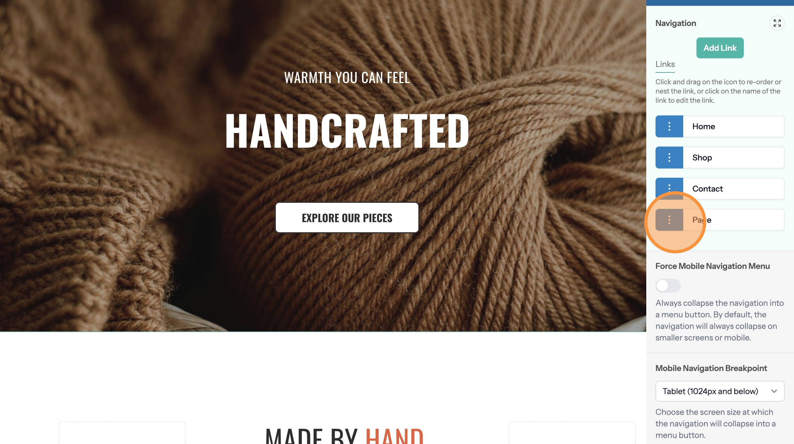
Navigation is managed separately from your page list. Adding a page doesn't automatically add it to your menu — you decide what goes in the nav and in what order.
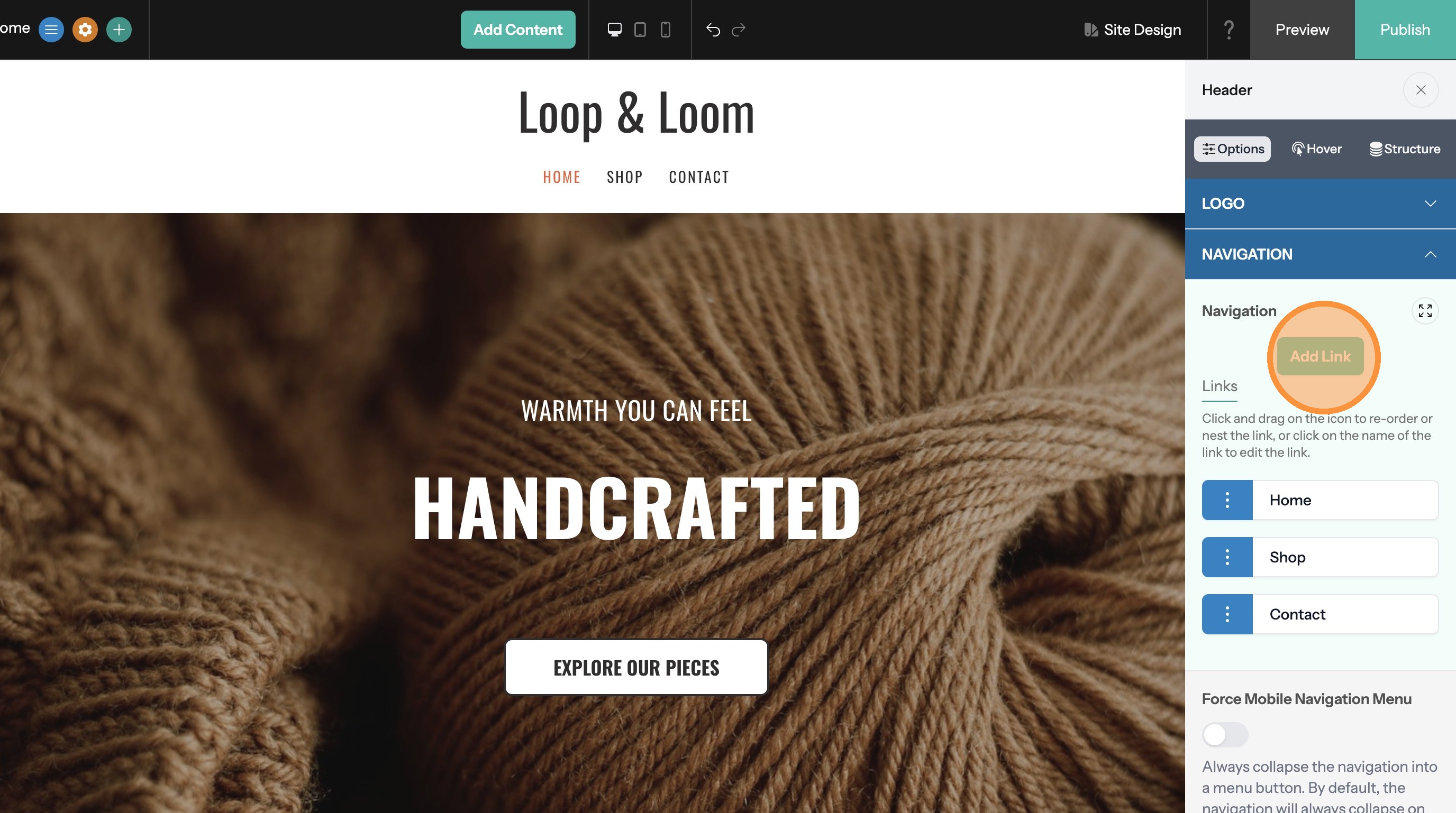
- In the editor, click anywhere in the header area at the top of your page (click near the logo or header background, not on an existing nav link).
- An options panel will appear. Expand the "Navigation" tab.
- You'll see a list of all your current navigation links.
Writing Blog Posts
Share news, updates, or stories with your visitors.
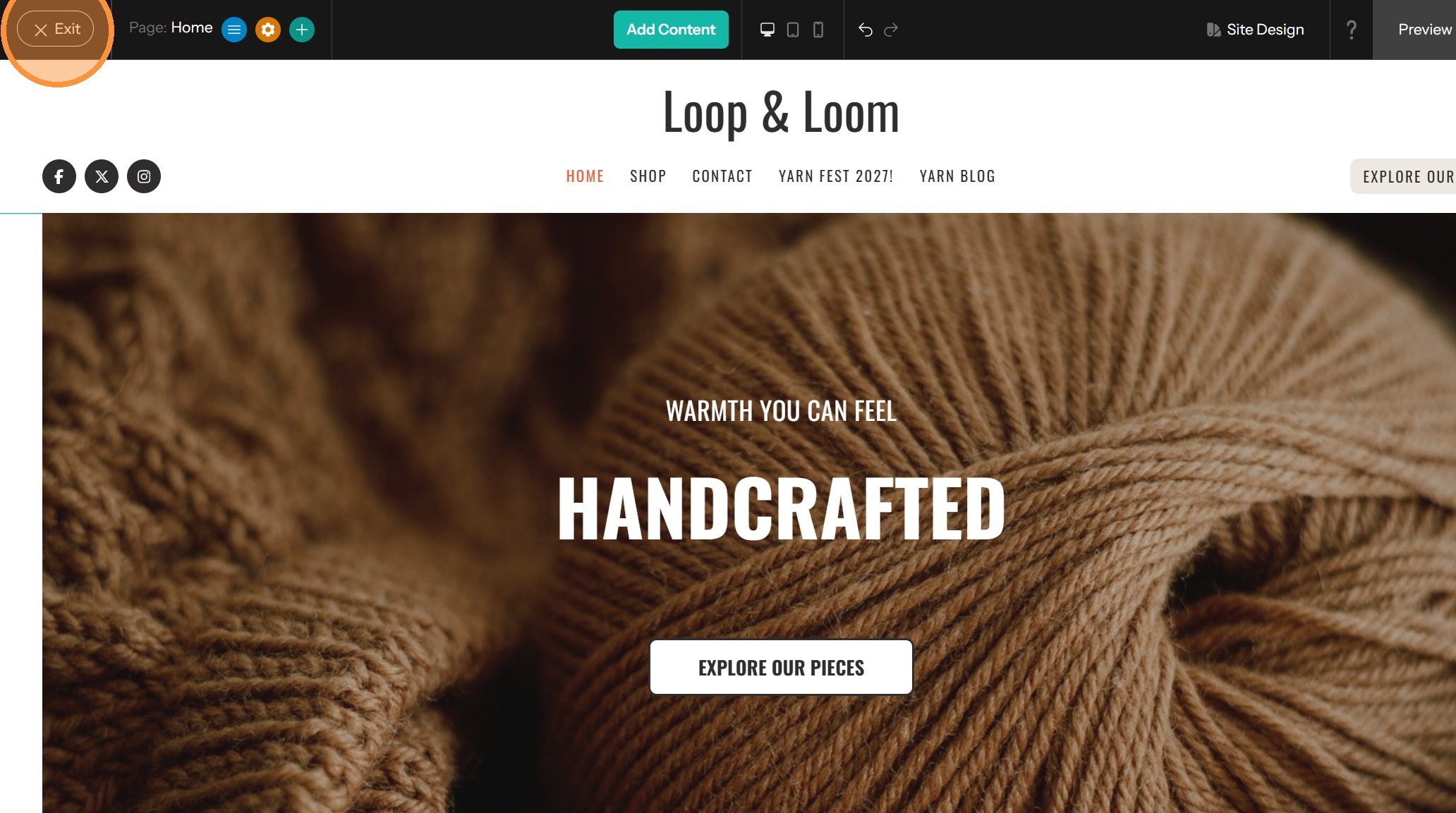
Your blog is managed from the Dashboard, not the page editor.
Writing a post
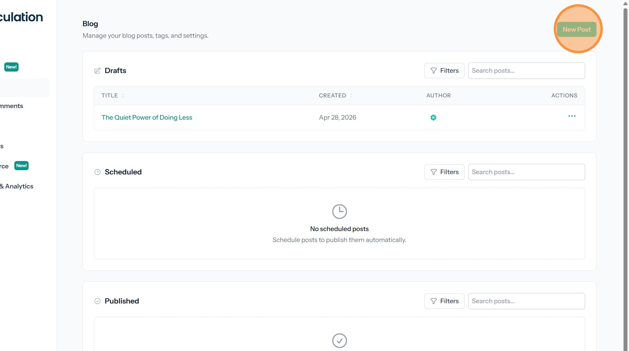
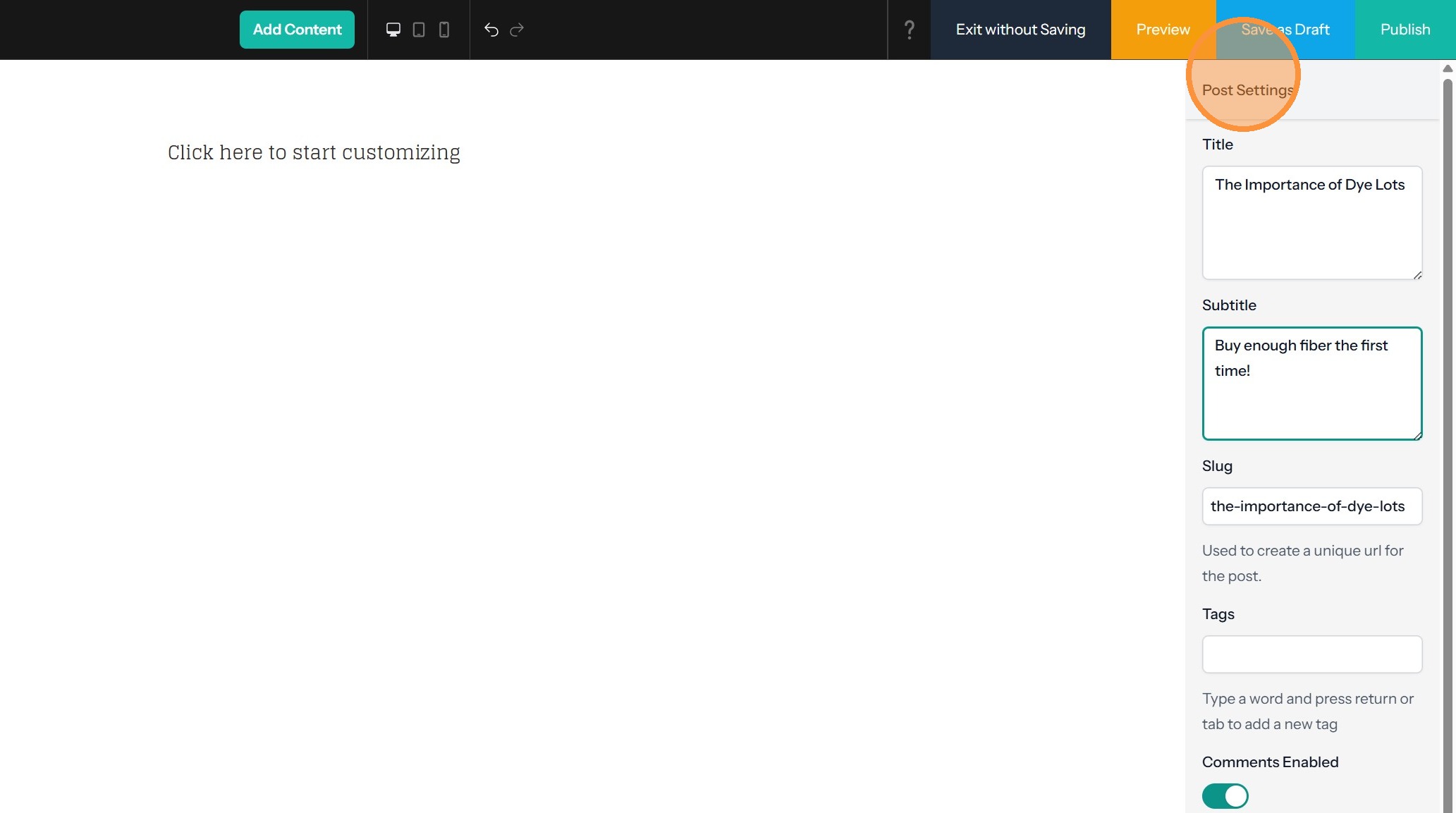
- From the Dashboard, click "Blog" in the left navigation, then click "New Post."
- The post editor uses the same components as your pages — Rich Text, images, and more — so it'll feel familiar.
- Your post settings (tags, publish date, featured image) live in the panel on the right.
- Click "Save as Draft" to save your progress, or "Preview" to see how it looks.
Adding blog to your navigation
The blog isn't in your nav menu automatically. To add it:
- Click the header area, then expand the "Navigation" tab (same panel from the section above).
- Click "Add Link" → "System" → "Blog Index."
- Give the link a name (like "Blog" or "News") and save.
"Read More" breaks
Want your blog list to show just a preview of each post, with a "Read More" link to the full thing? Drag the "Blog Read More Break" component between two Rich Text blocks in your post. Everything above the break shows in the preview; everything below only shows on the full post page.
Organizing posts with tags
Tags let you group related posts — by topic, category, or audience. Tag each post as you write it, then create a page that links to all posts sharing a tag. This gives you the effect of multiple topic-specific sections without needing multiple blogs.
Forms
Let visitors reach out to you right from your website.
The Form component lets you build contact forms, newsletter signups, and surveys — no coding required.
- Open "Add Content" and drag the Form component onto your page.
- Click it to open the options panel, where you can add, remove, or reorder fields (name, email, message, and more).
- Customize the button text and the confirmation message visitors see after submitting.
Cool Features to Explore
Once you're comfortable with the basics, these are worth a look.
You don't need any of these to build your first pages — but they're all here whenever you're ready to level up.
Page Section Layouts
Start a section with a pre-made design instead of building from scratch. Hero banners, feature grids, testimonial blocks — one click to add.
Mobile Preview
See exactly how your page looks on a phone, tablet, or desktop — right inside the editor. No guessing.
Hover Effects
Add subtle animation to images, buttons, and sections when visitors mouse over them.
Image Filters
Apply visual effects like blur or sepia to any image directly in the editor. No photo editing software needed.
Anchor Links
Link to a specific section on a page — great for long pages and "Jump to" navigation.
Form Builder
Build contact forms, newsletter signups, and surveys. Responses go straight to your email inbox.
Undo / Redo
Make a mistake? No problem. Undo and Redo buttons are right there in the editor toolbar.
More Component Types
Hero sections, Image Galleries, Slideshows, FAQ Accordions, Testimonials, Team Profiles, Countdown Timers, Flip Cards, Progress Bars, and more.
Publishing Your Site
The final step — making your changes visible to the world.
Everything you build in the editor stays private until you publish it. That means you can take your time, save your progress, and come back later without worrying about visitors seeing an unfinished page.
- Click Preview to check how your changes look before anyone else sees them.
- Happy with everything? Click the Publish button, usually near the top right of the editor.
- That's it — your site is live! Changes are visible to visitors right away.
Questions? Stuck on something?
That's what I'm here for. Your hosting plan includes personal support — don't hesitate to reach out. There are no silly questions.